Table of Contents
Introduction
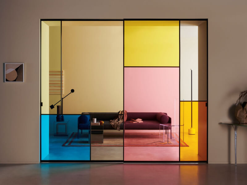
Color psychology is one of the most powerful tools in a designer’s arsenal. The right color scheme can make or break a design, setting the mood, conveying a message, and creating a sense of harmony. But what exactly is a color scheme, and how do you create one?
What is a Color Scheme?
A color scheme is a set of colors that are used together in a design. It can be as simple as two colors or as complex as a dozen or more. The key is that the colors work together to create a cohesive look and feel. Color psychology and interior design trends often guide the choice of color schemes to create harmonious color combinations that enhance the overall aesthetic.
Color schemes are used in a wide range of design disciplines, from graphic design and web design to interior design and fashion. They can be used to create a sense of harmony, balance, and contrast, and to convey a particular mood or message. Understanding color theory is essential for creating effective color schemes that align with the 60-30-10 rule often used in interior design.
Types of Color Schemes
There are several types of color schemes, each with its own set of rules and guidelines. Here are some of the most common:
1. Monochromatic
A monochromatic color scheme uses variations of a single color. This can create a sense of unity and simplicity, but it can also be limiting. Utilizing the color scheme 60-30-10 rule can help maintain balance in such schemes.

2. Analogous
An analogous color scheme uses colors that are next to each other on the color wheel. This creates a sense of harmony and can be used to create a soothing, cohesive look. These harmonious color combinations are popular in interior design trends for creating serene environments.

3. Complementary
A complementary color scheme uses colors that are opposite each other on the color wheel. This creates a sense of contrast and can be used to create a bold, dynamic look. Color psychology suggests that such contrasts can evoke strong emotions and attention.

4. Triadic
A triadic color scheme uses three colors that are equally spaced around the color wheel. This creates a sense of balance and can be used to create a vibrant, energetic look. Triadic schemes are effective in interior design trends aiming for lively and balanced spaces.

5. Split-complementary
A split-complementary color scheme uses a base color and the two colors adjacent to its complement. This creates a sense of contrast and can be used to create a sophisticated, nuanced look. Such schemes leverage color psychology to create visually appealing yet subtle designs.

6. Tetradic
A tetradic color scheme uses two pairs of complementary colors. This creates a sense of complexity and can be used to create a rich, layered look. Tetradic schemes can be particularly effective in larger spaces where more colors are needed to maintain interest.

Creating a Color Scheme
Creating a color scheme involves selecting colors that work well together and convey the desired mood or message. Here are some tips for creating a color scheme:
1. Start with a Base Color in Interior Design Trends
Choose a color that will serve as the foundation of your color scheme. This can be a neutral color like white, black, or gray, or a bold color that sets the tone for the rest of the scheme. Color psychology can guide the selection of this base color to evoke the desired mood.
2. Choose Colors That Work Well
Use the color wheel to select colors that are complementary, analogous, or triadic. You can also experiment with different shades, tints, and tones of your base color to create a cohesive look. Harmonious color combinations are key to achieving a balanced design.
3. Consider the Mood You Want to Create with Color Psychology
Different colors convey different moods. Warm colors like red, orange, and yellow can create a sense of energy and excitement, while cool colors like blue, green, and purple can create a sense of calm and serenity. Color psychology plays a crucial role in determining the mood.
4. Think About the Context
The colors you choose should be appropriate for the context in which they will be used. For example, a bright, bold color scheme might be appropriate for a children’s toy, but not for a corporate logo. Context is essential in interior design trends and overall home decor.
5. Test Your Color Scheme
Before finalizing your color scheme, test it in different contexts to make sure it works well in different lighting conditions and on different materials. This step ensures the practical application of color psychology in real-world settings.
Conclusion
Color schemes are an essential part of design, and creating a cohesive and effective color scheme requires careful consideration and experimentation. By understanding the different types of color schemes and following some basic guidelines, you can create a color scheme that is both beautiful and effective, in line with the latest interior design trends and principles of color theory.
FAQ
Q1. How do I decide which color scheme is best for my space?
A1. Consider the mood you want to create and the function of the space. Monochromatic schemes offer harmony, while complementary schemes provide contrast. Analogous schemes are soothing, and triadic schemes are vibrant.
Q2. Can I use more than one color scheme in a single room?
A2. Yes, you can combine elements of different color schemes to add complexity and interest. For instance, using a monochromatic base with pops of complementary colors can create a dynamic yet cohesive look.
Leave a Reply